As we're unlikely to see terraces again at football, this is the virtual equivalent where you can chat to your hearts content about all football matters and, obviously, Arsenal in particular. This forum encourages all Gooners to visit and contribute so please keep it respectful, clean and topical.
Managed to finally add the jersey to my basket on the official site........decision decisions.......
Have you not got the original?
I do.
Yours for €500.
And a nosh.
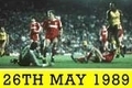
During my yoof I was strictly a home shirt only kinda girl. In fact the first away shirt I ever bought was when Nike did that yellow 1989 homage a few years back.
Update 1 - The site crashed before I could buy it which I'm actually glad about. Fuck Adidas.
Update 2 - I think I'm after finding out why the crest and logo are so close together compared to the original but the reason is so fucked up I'm afraid to say it because as far as I'm concerned it spells the end of mankind as we know it.
Update 3 - €450 and a reach around......my final offer
Managed to finally add the jersey to my basket on the official site........decision decisions.......
Have you not got the original?
I do.
Yours for €500.
And a nosh.
During my yoof I was strictly a home shirt only kinda girl. In fact the first away shirt I ever bought was when Nike did that yellow 1989 homage a few years back.
Update 1 - The site crashed before I could buy it which I'm actually glad about. Fuck Adidas.
Update 2 - I think I'm after finding out why the crest and logo are so close together compared to the original but the reason is so fucked up I'm afraid to say it because as far as I'm concerned it spells the end of mankind as we know it.
Update 3 - €450 and a reach around......my final offer
Sorry rodders I cannot accept your offer. My momma taught me to never sell my sweet ass on the cheap.
And I have to hear your theory behind the crest and logo being fucked up......
I'm intrigued about that too
Probably something to do with the old (far better) crest and the club being able to squeeze more money out of it
Ok I pulled it out of the wardrobe last night (no not a euphemism ).
I tried on my old original squashed wasp jersey and well fuck me the crest and logo are very close together!! Maybe not as close as this replica but not far off.
Ok I pulled it out of the wardrobe last night (no not a euphemism ).
I tried on my old original squashed wasp jersey and well fuck me the crest and logo are very close together!! Maybe not as close as this replica but not far off.
And that's when it's stretched to twice it's original size
Ok I pulled it out of the wardrobe last night (no not a euphemism ).
I tried on my old original squashed wasp jersey and well fuck me the crest and logo are very close together!! Maybe not as close as this replica but not far off.
You're right, the original does have the crest and Adidas logo a lot closer together than what a modern shirt would look like but by pushing it even closer together again in the repop it looks absolutely ridiculous.
In the original, a portion of the Adidas logo is to the left of the J of JVC and a portion of the crest is to the right of the C in JVC underneath it. The reissue has the the logo, crest and JVC all in a perfect square with no overlapping.
Which brings me to the point that fucked my mind the other day when I discovered why this is.
You may have noticed in the advertising blurb for this jersey that it is being marketed as being unisex, I don't think I've ever seen a football shirt described as that before. So the reason the crest, logo and JVC are all squashed together as one big square print is because aesthetically it looks better when worn by someone of the fairer sex.
I waited 20 years for that jersey, the world is fucked
Oh wow, I didn't see the blurb, isn't that just typical of where we are in football now.
I saw a picture of Lee Dixon in the old top the other day and the crest/adidas logo were closer together but then I noticed this pic of the superswede and the placement seems more normal
Ok I pulled it out of the wardrobe last night (no not a euphemism ).
I tried on my old original squashed wasp jersey and well fuck me the crest and logo are very close together!! Maybe not as close as this replica but not far off.
You're right, the original does have the crest and Adidas logo a lot closer together than what a modern shirt would look like but by pushing it even closer together again in the repop it looks absolutely ridiculous.
In the original, a portion of the Adidas logo is to the left of the J of JVC and a portion of the crest is to the right of the C in JVC underneath it. The reissue has the the logo, crest and JVC all in a perfect square with no overlapping.
Which brings me to the point that fucked my mind the other day when I discovered why this is.
You may have noticed in the advertising blurb for this jersey that it is being marketed as being unisex, I don't think I've ever seen a football shirt described as that before. So the reason the crest, logo and JVC are all squashed together as one big square print is because aesthetically it looks better when worn by someone of the fairer sex.
I waited 20 years for that jersey, the world is fucked
There is a solution to your disappointment AND Dilemma Rodders!
Ok I pulled it out of the wardrobe last night (no not a euphemism ).
I tried on my old original squashed wasp jersey and well fuck me the crest and logo are very close together!! Maybe not as close as this replica but not far off.
You're right, the original does have the crest and Adidas logo a lot closer together than what a modern shirt would look like but by pushing it even closer together again in the repop it looks absolutely ridiculous.
In the original, a portion of the Adidas logo is to the left of the J of JVC and a portion of the crest is to the right of the C in JVC underneath it. The reissue has the the logo, crest and JVC all in a perfect square with no overlapping.
Which brings me to the point that fucked my mind the other day when I discovered why this is.
You may have noticed in the advertising blurb for this jersey that it is being marketed as being unisex, I don't think I've ever seen a football shirt described as that before. So the reason the crest, logo and JVC are all squashed together as one big square print is because aesthetically it looks better when worn by someone of the fairer sex.
I waited 20 years for that jersey, the world is fucked


