Yes, charts. The superior way of posting stats.
All about how the Premier League developed over the last 11 years, no less.
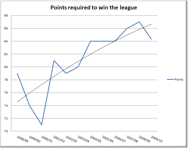
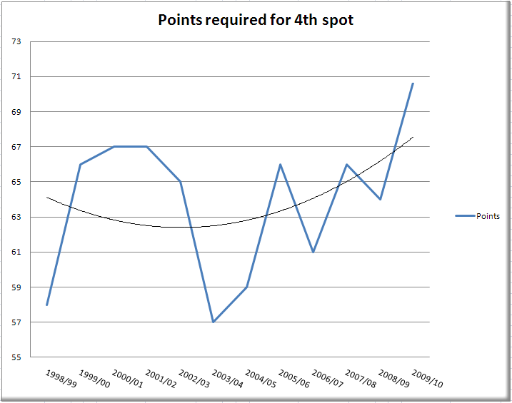
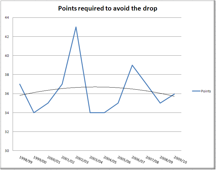
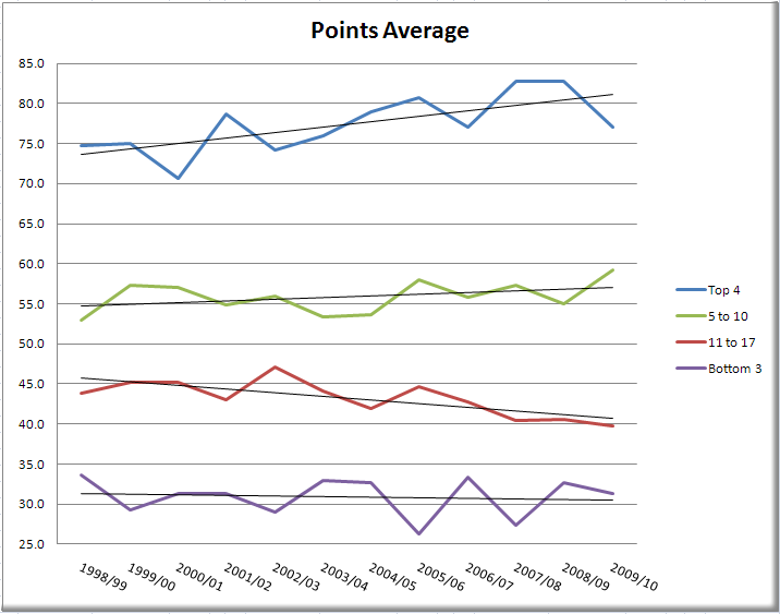
Some disclaimers: "points required to ..." doesn't mean the actual number of points that the champion, 4th or 17th had - but the minimum number of points that were required to be one point ahead of the second, 5th and 18th. Not ideal, but more ideal than the other way. Everything else should be pretty self-explanatory.
I'm not going to read too much into it, but they are still interesting. Some myths, like how it's supposedly much easier to win the title this year compared to the past, should be put in question. Not that the points total is proof one way or the other of how difficult it was to get those points, but on current pace the second will still have the 3rd most points ever.
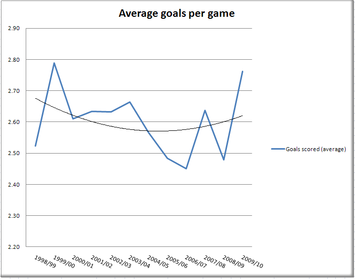
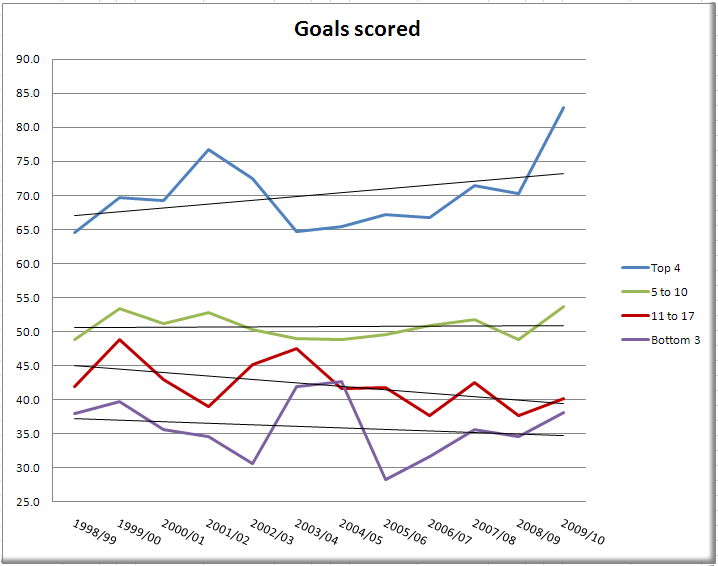
One more interesting thing is how the goalscoring has generally gone down over the last 10 years only to take a massive spike this year. Why that is is difficult to say, but I like it.